
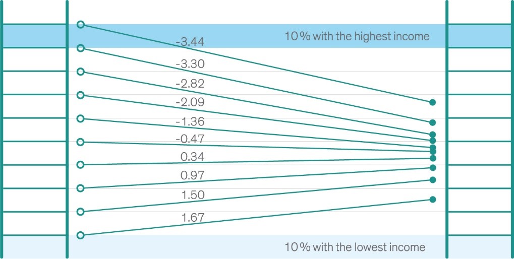
Over- and underestimation of relative income positions
When asked to locate themselves in the distribution of incomes visualized as a 10-step ladder, respondents displayed a bias towards the middle compared to their actual income: many people thought they are closer to the middle in terms of relative income than they actually are.
Explanation: the left figure displays the actual position on the income ladder in our sample, the right figure shows where people with different incomes tend to place themselves. Numbers show by how many deciles (10-percent steps) respondents misperceive their own relative position on the income ladder on average.
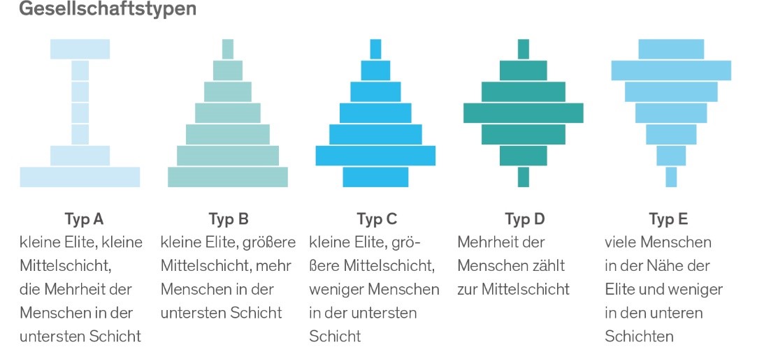
Perceptions of distribution in society
From five potential shapes that a society could have, people were asked to choose the one they think Germany most closely resembles, as well as which one they would prefer Germany to be like:
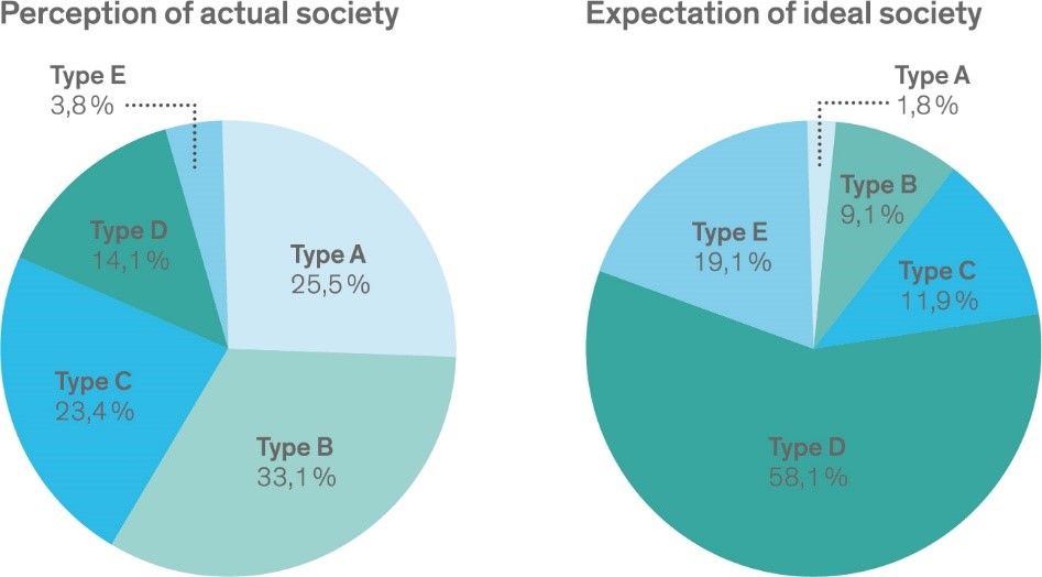
The current distribution was perceived to be quite unequal: more than 50 percent of respondents thought that the largest group in Germany is the one with the lowest incomes (type A or B). In contrast, as their ideal shape they chose a more equal distribution (type D or E).
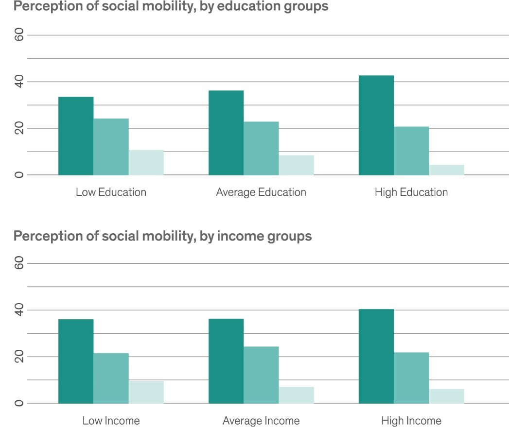
Perceived social mobility of the lowest income group
Asked about the prospects of upward mobility for children from the lowest income quintile (lowest 20 percent), different groups of respondents differed in their assessment. Respondents with lower incomes or lower levels of education were more optimistic: compared with other respondents, they thought that more children will make it to the highest income group (top 20 percent) and that fewer will remain in the lowest income group (bottom 20 percent).
Explanation: The figure shows the average responses to the question:
“What percentage of children from the lowest income group will grow up to be in...”
- “...the lowest income group (bottom 20 percent)?”
- “...the middle income group (middle 20 percent)?”
- “...the highest income group (top 20 percent)?”
Responses were sorted according to the respondents’ education (top chart) and income (bottom chart).
Income inequality and upward mobility perceptions across regions
Perceptions of income inequality and upward social mobility vary across regions. Shaded areas with darker colors represent mid-sized regions (NUTS-2 in the unified official EU nomenclature) where many respondents perceive income inequality to be too high (left map), and regions with lower perceived upward mobility (right map).
The regional differences of the two types of perceptions are not strongly correlated. Respondents in East Germany are more concerned about income inequality. No clear East-West divide exists for social mobility perceptions.
